
The new Google Play application store has released a new design for the desktop version . This new design is inspired by material design and is committed to minimalism. Let’s see everything that has changed in the desktop version of the app and game store, Google Play Store.
It’s been a long time since the desktop version of Google Play received a change . Well, that time has come, apparently not for everyone, but it will be a matter of a few weeks before this design reaches the rest of the users.
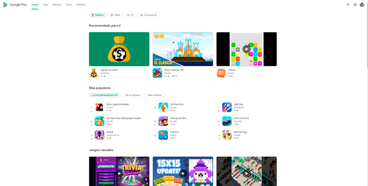
The first thing we go to when we enter the Google Play Store is a lot of empty space (it all depends on the monitor and resolution you use), but it seems that Google has opted to center all the content on the web.
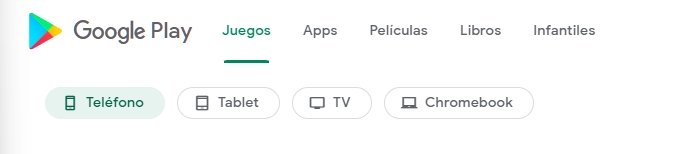
Now the Google Play menu is in the upper area, where we can see only 5 categories: games, apps, movies, books and children’s. Within each category we can see that depending on whether we choose games or apps we can install them on a different device.
This is a great idea, as we can see the apps available for each of the devices . In the case of games, we can clearly see that there are games for mobile, tablet, TV and Chromebook.
The new design of the Google Play Store is much clearer , that is, we can see everything clearly, since the size of the icons and the preview of the games and applications is much larger.
Something that hasn’t changed much is the “Recommended for you” space, a section that makes a selection of recommended applications and games based on those you have downloaded on your mobile or had previously downloaded.
Now you know the new design of the Google Play application and game store , where minimalism has been opted for and which has received an adaptation for the desktop version .
Free apps that you should install on your mobile
