

Not even two days have passed since 2023 and Google has already set to work to renew the design of its main apps. They have started with YouTube by adding a subtle change to the app’s playback progress bar when using dark mode . Traditionally, this bar, which is the one just below the video to tell you how much of it has been played, is red. However, in the Android app it has changed to a gray or white color.
It should be noted that this change cannot yet be seen on all mobiles. Apparently Google has only rolled it out to a number of specific devices to test and then roll it out to all. The funny thing about this change is that it removes the gray part of the bar that told you how much of the video has been loaded. Now you will only see how much of the video has been played.
This is the subtle design change that YouTube launches in 2023
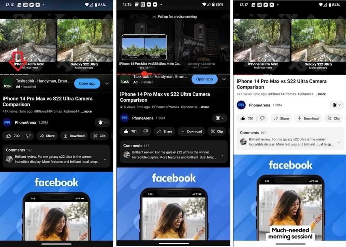
As you can see in the screenshots above, YouTube’s new design removes the red color from the playbar when the app is in portrait mode . If you put the app in landscape mode (i.e. when playing a video in full screen), the bar will disappear, but when you touch the screen you will see that it will remain red. Also, if you have the app with a light theme, the bar stays red even in portrait mode. The change is only visible on YouTube with dark mode.
The truth is that this change in the design of the YouTube app is quite strange because it does not seem to contribute anything useful to the app . It is true that the red color of the bar may annoy some people, but surely many more people will be upset when they cannot see how much video has already been loaded.
Let’s remember that recently the YouTube video progress bar was improved with a very useful function that shows you the most important parts of a video. So it’s a little disappointing that they’re going to make it worse with a design that doesn’t really benefit the user experience.
Fortunately, this change is still in the testing phase , so it is very likely that it will end up being discarded based on user reception. And you… what do you think? Would you like to see Google implement this design change finally?
Source | PhoneArena
