
Android tablets have been around for many years, although official support for large screens came in 2011 with Android 3.0 Honeycomb . Since then, much ink has been spilled in the history of tablets. So much so that it even gave time to see its fall and subsequent rebirth from the ashes in recent years.
Until recently, however, Google hadn’t paid much attention to this niche with its operating system and apps (except for Nexus tablets). Last year things began to change with the launch of Android 12L, a version designed for these devices. The applications were missing, as many were not yet adapted to large screens. This seems to be about to change, because Google Play has finally adapted its interface to tablets and another 20 Google applications will do so soon.
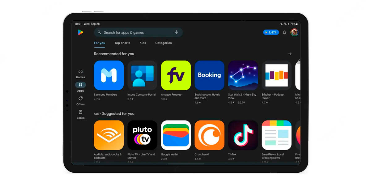
You will no longer see an empty store when you open the Play Store on your Android tablet
Knowing that Google will introduce its Pixel Tablet soon, it’s no surprise that the company is optimizing Android and its apps . Google is the main interested in its software working properly on tablets, otherwise your new device will be a failure.
Android 13L will not exist, but all the news for the tablets will be introduced directly in Android 13. However, with the applications it works differently, since each one will have to be updated separately. This is already happening and the Google Play Store is the first to change. Version 32.5.16-21 of the Play Store for Android brings several new features under the hood, but the change in its interface is perhaps the most important.
Right off the bat, it just seems that Google has simplified the interface and finished adapting it to Material You by giving the icons a greater presence, as well as adding cards and oval buttons that replace the classic pills.
However, the use of space totally changes in the Play Store for tablets. The buttons are no longer as close to the edge of the screen and are slightly larger to better interact with them. Meanwhile, app icons grow a lot , making it easy to access them for download or more data.
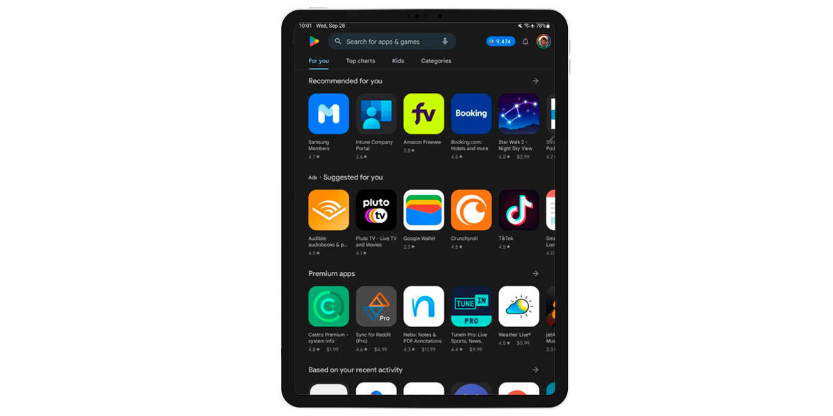
If you want to use your tablet in portrait (vertical) format , the interface will be more similar to that of a mobile: the sidebar of options will be removed and the app carousels will occupy the entire width of the screen.
This may seem like a silly novelty, but it will make life easier for thousands of Android tablet users. In addition, the use of screen space also gives a better appearance to the store , since there are not so many spaces that made it seem empty.
Finally, it was learned that Google is about to update the interface of another 20 applications developed by them . Its objective? The same as with the store: make them work and look better on tablets. When will the new updates arrive? We don’t know, but it shouldn’t be too long.